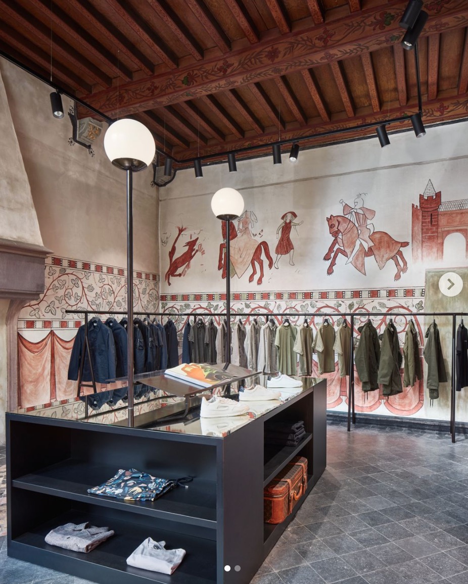
Generally speaking ,we’d like to follow human engineering to display our store/set up your visual merchandising, the key point was to let our client to see easily, take easily ,and recover easily.
However, in actual operating procedure, those principle may ignore often.
Today we gonna try to figure out some mistakes that easily come out when you set up display, anyone interested in those can check if our idea meet your experience and try to improve if it’s possible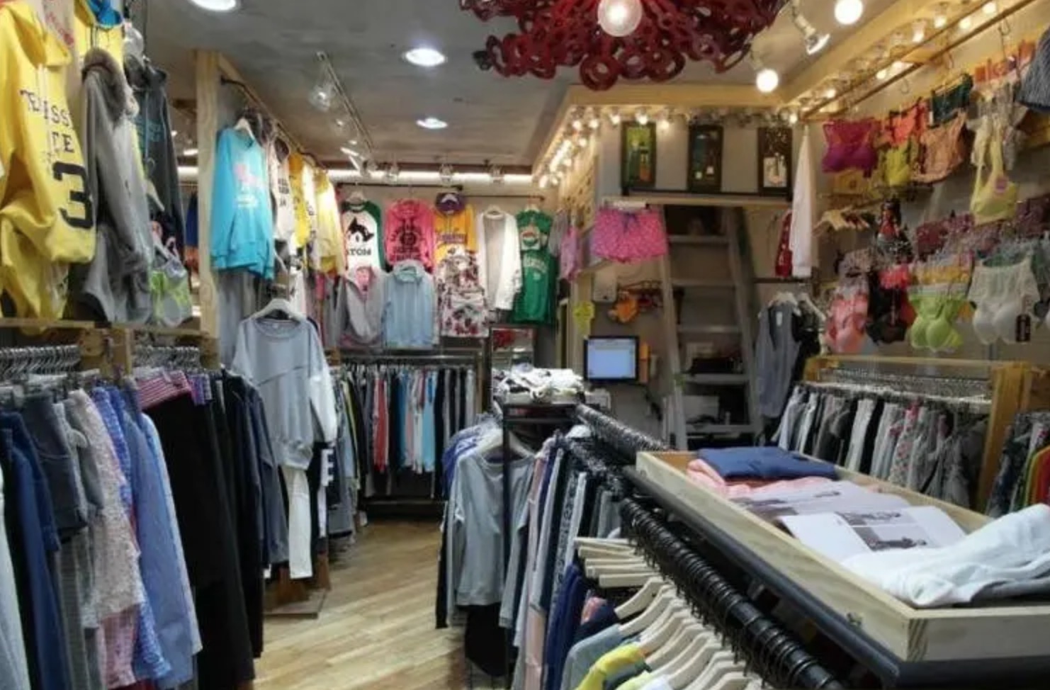 Sometimes when we walk into a clothing store, we will see the clothes hanging on the clothes rack appears heavy and full.
Check below photos, those coat hanger and wooden suit hanger just as same as we figure out.
This will lead a very bad result:when the client catch the clothes, this is very unfavorable for customers to take out the clothes and look at them and return to their original positions.
It may lead the clothes cheap-looking, you know what i am saying, everything including clothes, your clothes hanger, your mannequin in a mess, Lack of charm, complex, bad visual merchandising, disorder, then finally clients will be away from your store.
So how would be the solution for that?
The answer was quite simple:Following the principle of 2/3 display quantity and space, the most appropriate display quantity and space should be 2/3 of the length of the full hanger rack bar.
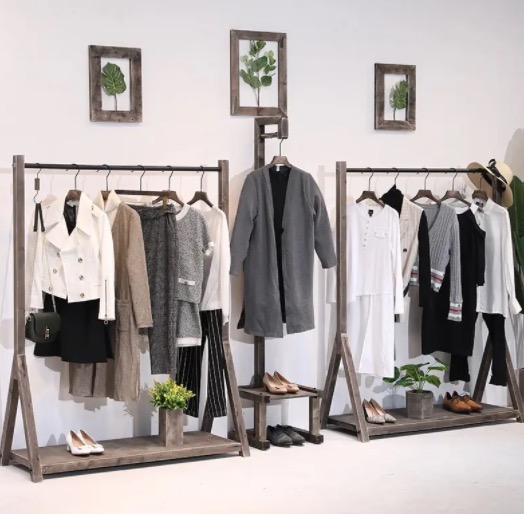

Basically, all clothing stores will set up sidekick display. we found that the sidekick display on the right side of some stores will show its wooden clothes hangers facing the door to let customers see the front of the clothes.
However in fact, it won’t show too much obviously positive effects if it hangs too much clothes and use too much wooden coat hanger , and the main thing is that customers and shopping guides will be very uncomfortable when picking up clothes. Due to such an inconvenient way to pick up, even after seeing a few pieces of clothing, customers will not continue to look back at the clothes, which is really the loss outweighs the gain no matter what kinds of luxury clothes hanger or bespoken hanger you use.
So how would be the solution for that?
we’d like to suggest this way:
When customers enter the hall from the door of the store, the pant hangers or top hangers and the hanger hooks observed from the main route they focus should always facing inward or left.
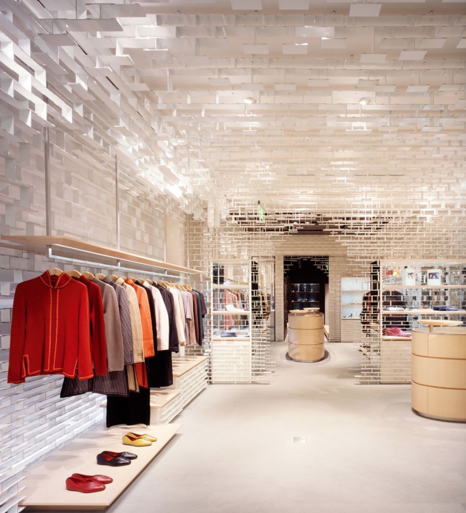
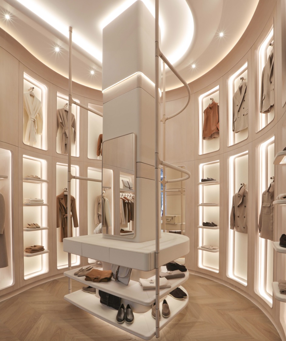
Many clothing stores will use platforms, cabinets or display counter to display stacked items. In some stores, if the stacked products are placed too high or too low, unless the customer is very interested, they will not pick it up or touch it. They have had to bend over or put a small bench to pick it up. It didn’t good for customer’s shopping experience.
So how would we solve this kind of question?
we’d like to advise you to check below content:: The effective display height of stacked products should be between 60cm and 180cm, to avoid stacked display below 60cm.
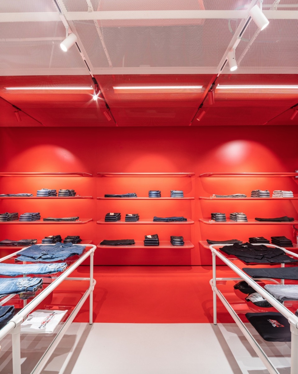
In the same way, if the clothes are hung too high, the customer wants to see the clothes and can’t take them off, and the shopping guide also has to take the clothes rails to take the clothes off, which is also a very bad experience.
check below photo.
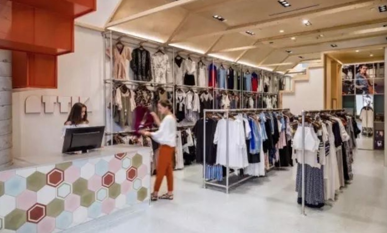
I don’t know if you have noticed a question that many people ignore . Many shops have unpacked the clothes after purchasing, and the creases have not been eliminated, and they are directly hung on non slip hangers or worn on translucent mannequins for display.
This approach greatly affects the texture of the clothing, which is directly detrimental to the display effect. Think about it from another perspective. Suppose you are a customer. When you see the clothes on display are wrinkled and have no texture, will you really want to buy them?
Don’t worry, there are some useful tips for you: The clothes on display should be ironed and arranged flat, and items such as tags and ropes should be hidden in the clothes; all buttons and zippers should be in place.
